
As we move through 2025, color trends are blending comfort, sophistication, and personality in ways that invite us to reimagine our homes. From warm earth tones to bold jewel hues, this year’s Colors of the Year reflect a desire for spaces that feel personal, grounded, and timeless — while still leaving room for creativity and flair.
This guide is inspired by Better Homes and Gardens’ blog, "Every 2025 Color of the Year That's Been Announced So Far." If you’re updating your home in Brantford, Brant County, or anywhere in Ontario, these trending colors can help you create spaces that feel both modern and meaningful.
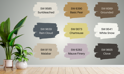
Sherwin-Williams 2025 Color Capsule of the Year
Grounded SW 6089
Where to Use:
This versatile, earthen brown is ideal for living rooms, home offices, or bedrooms, where its richness can create a sense of calm. It’s also stunning on accent walls in modern or rustic kitchens.
Complementary Colors:
Grounded pairs beautifully with warm creams, burnt orange, soft sage, and deep charcoal. It also works well with brass or black fixtures for added contrast.
Emotional Feel:
Grounded lives up to its name, evoking feelings of stability, comfort, and reassurance. Its natural, earthy vibe brings a sense of security and warmth, making spaces feel safe, welcoming, and serene.
Sunbleached SW 9585
Where to Use:
This adaptable light neutral works well in open concept spaces, entryways, and bedrooms where you want a soft, airy foundation. It’s perfect for minimalist or Scandinavian-inspired interiors.
Complementary Colors:
Pair Sunbleached with muted blues, sage greens, and soft terracottas. It also complements natural woods and matte black accents.
Emotional Feel:
Sunbleached feels calm, understated, and flexible, making it ideal for homeowners seeking a timeless, tranquil aesthetic. It fosters a sense of clarity and simplicity, perfect for creating peaceful retreats.
Chartreuse SW 0073
Where to Use:
This bold yellow-green brings energy to powder rooms, creative studios, or playrooms. For a more daring design, use it on kitchen cabinets or a front door for a vibrant first impression.
Complementary Colors:
Chartreuse pairs well with navy blue, warm wood tones, soft grays, and even deep plum for a playful contrast.
Emotional Feel:
This color radiates joy, creativity, and spontaneity, making it perfect for spaces meant to inspire fun, bold ideas and eclectic energy.
Rain Cloud SW 9639
Where to Use:
Rain Cloud is perfect for bathrooms, bedrooms, and dining rooms, where you want to introduce a moody, sophisticated atmosphere. It also works well on cabinets or built-in shelving.
Complementary Colors:
Pair it with warm whites, soft taupes, and muted greens. Metallic finishes like brass or brushed nickel add extra elegance.
Emotional Feel:
This deep gray-blue evokes feelings of calm, introspection, and elegance, ideal for spaces where you want to encourage relaxation and reflection.
Clove SW 9605
Where to Use:
Clove’s near-black brown is perfect for accent walls, powder rooms, or cozy dens. It’s also striking in kitchens with natural wood cabinetry or as a trim color for bold contrast.
Complementary Colors:
Pair Clove with warm taupes, soft blush, rustic orange, and deep green. It also looks stunning with matte black hardware.
Emotional Feel:
Clove brings depth, mystery, and coziness, making rooms feel intimate and grounding. It offers a bold yet comforting aesthetic
Malabar SW 9110
Where to Use:
Malabar’s soft beige is perfect for bedrooms, living rooms, and hallways, where it creates a calming, neutral backdrop. It’s great for layering textures and colors.
Complementary Colors:
It pairs effortlessly with soft greens, warm terracotta, and creamy whites.
Emotional Feel:
Malabar feels inviting, gentle, and serene, creating a space that feels soft, warm, and nurturing — ideal for relaxation and casual comfort.
Bosc Pear SW 6390
Where to Use:
This rich golden hue works beautifully in kitchens, dining rooms, or front doors, where you want to bring warmth and energy.
Complementary Colors:
Bosc Pear shines next to deep greens, rich browns, navy blue, and soft whites.
Emotional Feel:
This hue exudes optimism, warmth, and connection, bringing vintage charm while still feeling fresh and curren
White Snow SW 9541
Where to Use:
This crisp white is ideal for ceilings, trim, walls, or cabinets — anywhere you want maximum light reflectance.
Complementary Colors:
It complements everything, from soft pastels to bold jewel tones to earthy neutrals.
Emotional Feel:
White Snow feels clean, fresh, and expansive, creating a sense of openness, clarity, and renewal.
Mauve Finery SW 6282
Where to Use:
Mauve Finery adds a romantic touch to bedrooms, powder rooms, or reading nooks. It’s also lovely on furniture pieces.
Complementary Colors:
Pair with warm grays, deep greens, soft gold, and muted blues.
Emotional Feel:
This color brings soft elegance, tranquility, and a sense of whimsy, creating a space that feels both charming and sophisticated.
Other 2025 Colors of the Year
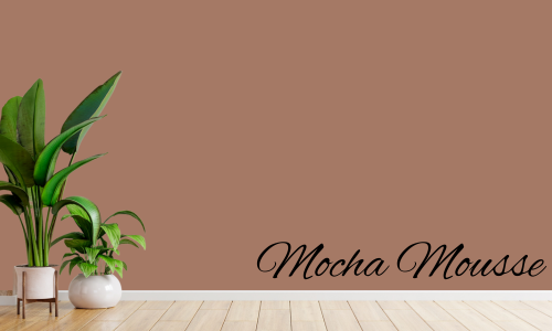
Mocha Mousse by Pantone
Where to Use:
Mocha Mousse is stunning in living rooms, bedrooms, or dining rooms, adding rich warmth and understated luxury.
Complementary Colors:
Works well with creamy whites, muted gold, deep greens, and navy.
Emotional Feel:
This color balances comfort and sophistication, bringing both earthiness and elegance, perfect for cozy, luxe interiors.
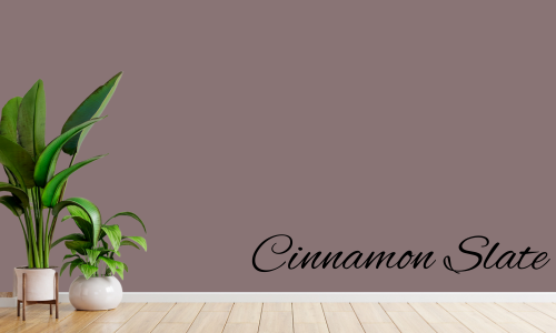
Cinnamon Slate by Benjamin Moore
Where to Use:
Cinnamon Slate’s mix of plum and chocolate brown is perfect for cozy living rooms, bedrooms, or intimate dining spaces. It also works well for kitchen cabinetry if you want a rich, unexpected twist.
Complementary Colors:
Pair it with soft gray, muted sage, warm terracotta, and brushed brass accents for a modern but cozy palette.
Emotional Feel:
This color feels grounded yet refined, evoking comfort, depth, and creativity. It’s perfect for creating intimate and personalized spaces.
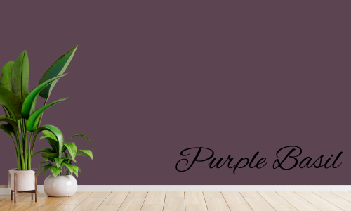
Purple Basil by Glidden
Where to Use:
This jewel-toned violet is a stunning choice for bedrooms, powder rooms, or home offices. It also works beautifully on kitchen islands or as a front door color.
Complementary Colors:
Purple Basil pairs well with soft grays, muted sage greens, deep navy, and warm gold accents.
Emotional Feel:
This color feels rich, creative, and inviting, offering both vibrancy and depth. It creates a sense of luxury with a welcoming twist.
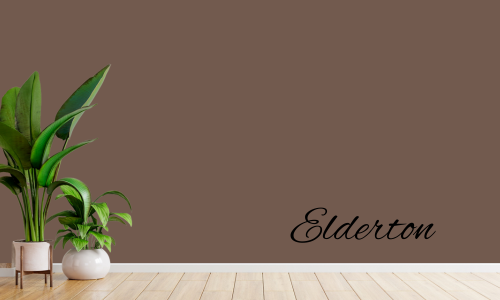
Elderton by Graham & Brown
Where to Use:
This medium brown is perfect for living rooms, home offices, and cozy dens. It also makes a sophisticated accent wall or trim color.
Complementary Colors:
Pair Elderton with warm creams, muted greens, rust tones, and matte black accents.
Emotional Feel:
Elderton evokes stability, warmth, and understated sophistication, creating comforting, timeless spaces that feel modern yet rooted in tradition.
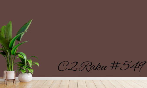
C2 Raku #549 (C2 Paint)
Where to Use:
This earthy brownish red adds drama to dining rooms, entryways, or intimate sitting rooms. It’s also beautiful for accent walls in contemporary homes.
Complementary Colors:
It pairs well with creamy whites, dark greens, soft golds, and muted blues.
Emotional Feel:
C2 Raku feels dramatic yet comforting, offering grounding warmth with a contemporary edge, ideal for making spaces feel cozy and artistic.

Mapped Blue by Dutch Boy
Where to Use:
This blue-gray hue works beautifully in bathrooms, bedrooms, and kitchens, adding a calm, contemporary vibe. It’s perfect for cabinets or built-ins too.
Complementary Colors:
Mapped Blue pairs well with warm creams, soft mustard, deep greens, and muted terracotta.
Emotional Feel:
This color feels balanced, peaceful, and flexible, creating an atmosphere of tranquility with just enough color to keep it interesting.
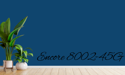
Encore 8002-45G (Valspar)
Where to Use:
This deep, saturated blue works in dining rooms, bedrooms, or living rooms that call for a rich, jewel-toned statement.
Complementary Colors:
Pair it with warm woods, soft gold, rich burgundy, or crisp white trim.
Emotional Feel:
This shade evokes luxury, depth, and bold confidence, making rooms feel elegant and dramatic without being overpowering.
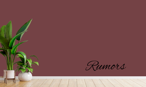
Rumors by BEHR
Where to Use:
This rich red with brown undertones adds warmth to dining rooms, front doors, or cozy dens. It’s also beautiful in traditional kitchens.
Complementary Colors:
Pair Rumors with warm whites, deep greens, brass accents, and rust tones.
Emotional Feel:
Rumors feels warm, nostalgic, and sophisticated, creating spaces that feel inviting, storied, and timeless.
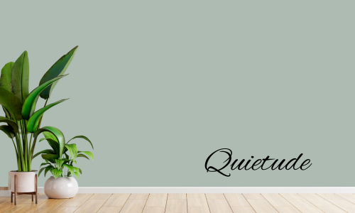
Quietude HGSW6212
Where to Use:
This soft sage green is ideal for bedrooms, bathrooms, or nurseries, offering a calm, organic feel. It also works well on cabinets or built-ins.
Complementary Colors:
Quietude pairs beautifully with warm whites, earthy browns, and soft blush tones.
Emotional Feel:
This color feels soothing, natural, and restorative, bringing a sense of calm and balance into any space.
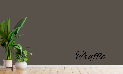
Truffle by STAINMASTER
Where to Use:
This deep brown hue is perfect for flooring, furniture, trim work, and even built-in cabinetry in homes that want a warm, grounding effect.
Complementary Colors:
Truffle works with creamy whites, muted greens, rust tones, and soft golds.
Emotional Feel:
This hue feels rich, grounding, and secure, bringing a sense of comfort and timeless strength to interiors.
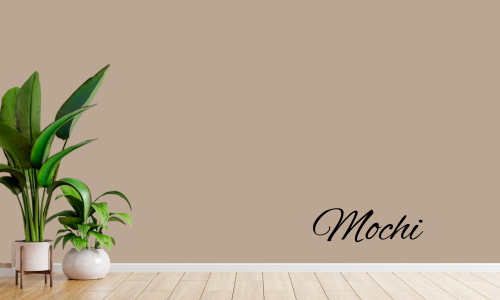
Mochi by Little Greene
Where to Use:
This light brown with peachy pink undertones is perfect for bedrooms, nurseries, and living spaces where softness is key. It’s also stunning on kitchen cabinets in modern homes.
Complementary Colors:
Mochi pairs beautifully with warm whites, muted greens, deep navy, and antique brass.
Emotional Feel:
This color feels warm, nurturing, and delicate, perfect for spaces that need a soft, welcoming touch with a hint of modern sophistication.
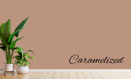
Caramelized by Dunn-Edwards
Where to Use:
Caramelized is perfect for cozy living rooms, dining rooms, and entryways where you want to create warmth and depth. It also works beautifully in kitchens with natural wood cabinetry or as a rich backdrop in home libraries or reading nooks.
Complementary Colors:
Pair Caramelized with creamy whites, muted sage greens, and soft terracotta to enhance its natural warmth. It also pairs well with deep charcoal for a more modern contrast.
Emotional Feel:
This rich, saturated hue evokes a sense of comfort, security, and nostalgia — helping to balance the fast pace of modern life with a sense of calm and connection. Caramelized wraps a space in a welcoming embrace, making it ideal for areas where you want to slow down and savor time with family and friends.
Final Thoughts: 2025 Colours of the Year at a Glance
The 2025 Colours of the Year showcase a clear shift towards warmth, richness, and nature-inspired comfort, offering a wide spectrum of hues that suit both bold and subtle design preferences. Whether you're drawn to earthy browns, grounding greens, deep reds, or calming blues, these trending colors offer something for every style and space.
Trends to Watch:
- Warm Neutrals: From Caramelized by Dunn-Edwards to Mochi by Little Greene, there’s a clear embrace of warm, grounding tones that create inviting, timeless interiors.
- Rich, Saturated Hues: Colors like Encore by Valspar and Purple Basil by Glidden reflect the growing popularity of deep, statement-making tones that bring personality and drama to spaces.
- Nature-Inspired Greens and Blues: Quietude by HGTV Home by Sherwin-Williams and Mapped Blue by Dutch Boy Paints reflect a collective desire to bring calm and organic beauty into our homes.
- Moody Reds and Purples: From the burnt reds of Rumors by BEHR to the plummy depth of Cinnamon Slate by Benjamin Moore, these colours balance coziness with sophistication, perfect for creating memorable rooms.
- Textural & Craft-Inspired: Colours like Hammered Black by Krylon and Violet by Minwax highlight how stain and texture continue to play an important role in furniture and architectural details, blending handcrafted beauty with modern design.
Using Colour to Shape Emotion in Your Home
The 2025 selections do more than follow aesthetic trends — they shape the mood and feel of a space:
- Warm tones offer comfort, coziness, and approachability, perfect for family spaces and personal retreats.
- Cool blues and greens bring a sense of calm, clarity, and balance, ideal for bedrooms, bathrooms, and offices.
- Deep jewel tones add drama, creativity, and luxury, great for dining rooms, statement walls, and bold accents.
Tailor Colours to Your Home’s Style
Whether your home is modern, rustic, traditional, or eclectic, this year’s palette offers ways to blend the fresh and trendy with the timeless and classic. Combining these colours with natural materials, curated textures, and thoughtful accents will ensure your home feels both current and personal.
The Best Colour in the Whole World is the Colour that Looks Best on You.
-Coco Chanel
Whether you’re updating your Brantford home to sell or creating a haven to enjoy for years to come, these 2025 colors offer inspiration for every room. If you’re thinking of buying, selling, or renovating in Brantford, Brant County, or anywhere in Ontario, I’m here to help you create a home that feels both stylish and personal.